In today’s competitive environment it’s crucial that business decisions are accurate and driven by up-to-date data. Organisations need fast access to insights, and those insights need to be accessible to more and more people. For this, you need effective data analytics.
Data analytics helps you turn raw data into actionable insights. It reveals trends and metrics that would otherwise be lost in the mass of information. It encompasses a diverse range of analytical techniques with the end goal of improving business operations – whether this is through increased efficiencies or a better understanding of customer behaviour.
With more data and data sources becoming available, you may be wondering how you can improve your data analysis and uncover deeper and more useful insights, fast.
Here, we’ll share some of the ways in which Tableau can help you take your data analysis from good to great.
Data preparation
One of the most important aspects of great data analysis is having data that is accessible and clean. However, many organisations still have siloed, dirty data, which can create a significant barrier.
Before you can get to analysis, the data would need to be cleaned and integrated into a single database – like a data warehouse or data lake – where the analytical coding or formulas can be applied.
The best data analytics tool?
With Tableau you can integrate almost any data source into the software for analysis and it’s latest feature, Tableau Prep, enables you to connect these data sources to clean, aggregate and otherwise prepare it for analysis.
Using smart features like fuzzy clustering, it turns repetitive tasks into one-click operations, fixes common data prep challenges, and will save you time between the collection of your data and turning it into actionable insights.
Visual Analytics
Another key part of great data analytics is making the insights accessible to others in your organisation – even those without a data or analytics background. The easiest way to do this is through data visualisation.
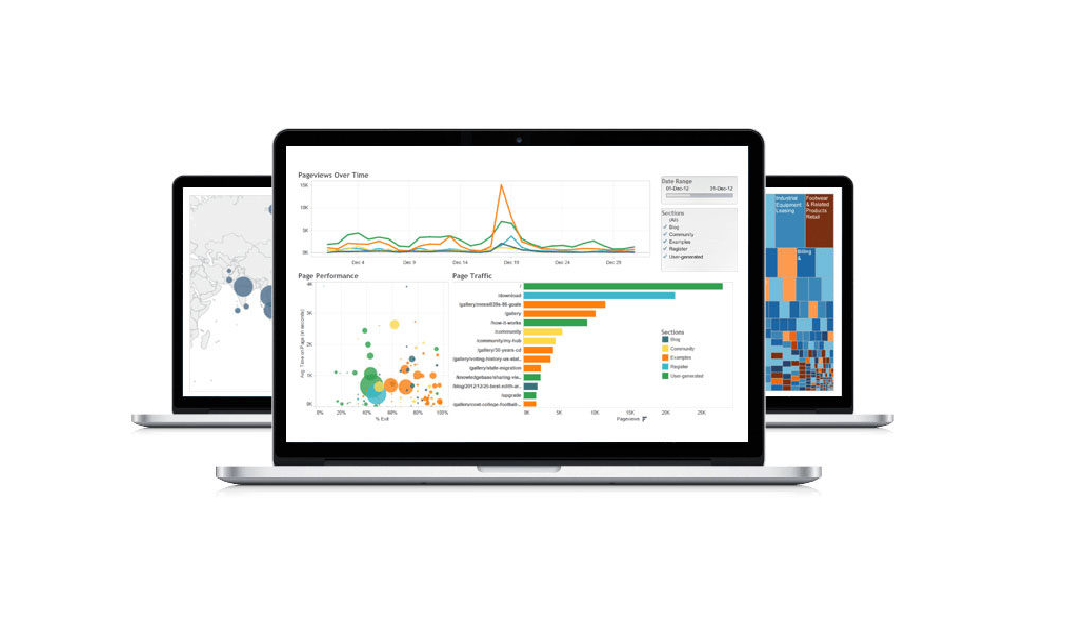
As a Visual Analytics tool Tableau makes this easy. In a tool like Excel analytics and visualisations are two separate steps. You need to do the data analysis first to uncover the insights before you can create visual representations of the information. In Tableau, you uncover the insights through visualisations. When data is imported into the platform it’s automatically turned into the most appropriate graph or chart so asking and answering questions of your data simpler and more intuitive.
By turning data into interactive visuals, Tableau not only makes your data easy for anyone to understand, but it also allows them to continuously dig deeper into the data and uncover further insights that may better answer the questions they have. Utilising drag-and-drop functionality, it allows people to easily manipulate the data to better understand it and the trends that are uncovered.
Accessible insights
Using data to drive decisions is now a crucial part of anyone’s job. So, it is no longer practical for a data science team to be the only ones to access capabilities for analysing business-critical data.
What is the best analytics tool? We think it one that empowers anyone in the organisation to quickly and easily analyse, display and share business insights from a variety of data sources, identify trends and act on these insights, as Tableau can.
 Asking questions in English
 Asking questions in English
The best part is, you don’t need to know how to code or programme. Tableau allows you to ask questions in natural language, so no matter what insight you’re looking for it’s easy for anyone to uncover.
Advanced analytics capabilities
To discover even deeper insights from your data and start using it to understand what could or should happen, rather than just what already has, you need to employ more advanced analytics techniques.
The term advanced analytics refers to both a type of analysis not usually attempted by business users, but also complex tasks often facilitated by scripting languages, machine learning, neural networks or multivariate statistics.
Data visualisation tools were historically considered incapable of advanced analytics, and it was often left to experienced data scientists.
Now however, Tableau can leverage models created in R or Python and make these advanced analytical techniques visual, interactive and accessible to more people.
Using Tableau you can address common analytics challenges including:
- Segmentation and cohort analysis
- Scenario and what-if analysis
- Sophisticated calculations and statistical functions
- Time-series and predictive analysis
- External services integration
With its analytical depth, Tableau is proving to be a powerful tool for data scientists leveraging sophisticated calculations, rapid cohort analysis and predictive analytics, so they can complete complex analysis within the platform and share the results in easy to understand visualisations.
The interactive visual nature of Tableau makes it easy for non-technical people to ask questions and uncover insights in their data, while also allowing experienced data scientists do more advanced analytics, discover deeper insights, and yield more valuable information fast.
By making data analysis accessible it increases collaboration and allows for better decision-making by anyone in an organisation – and will turn you data analytics from good to great!
If you’re interested in learning more about how Tableau can turn your data analysis from good to great or you would like a Tableau Trial, get in touch with us at FIRN Analytics.