FIRN Data Visualisation For NZ Businesses | © 2026 FIRN
If you’ve ever stared at a spreadsheet and felt your enthusiasm plummet, you already understand why data visualisation exists. Tables of numbers rarely tell a clear story, but transform them into an interactive dashboard or a well-chosen chart, and suddenly the story leaps off the screen. You can see where profits are rising, which regions are struggling, and how customer behaviour is shifting, all without sifting through endless cells.
For New Zealand businesses, data visualisation isn’t just a design upgrade; it’s a competitive advantage. It turns raw, unmanageable data into accessible insights that people can act on. This blog breaks down what data visualisation actually is, the main types to know, the key steps to doing it effectively, and which tools make it easier. By the end, you’ll see why investing in it is one of the smartest moves a modern business can make.
What Are the Main Types of Data Visualisation?
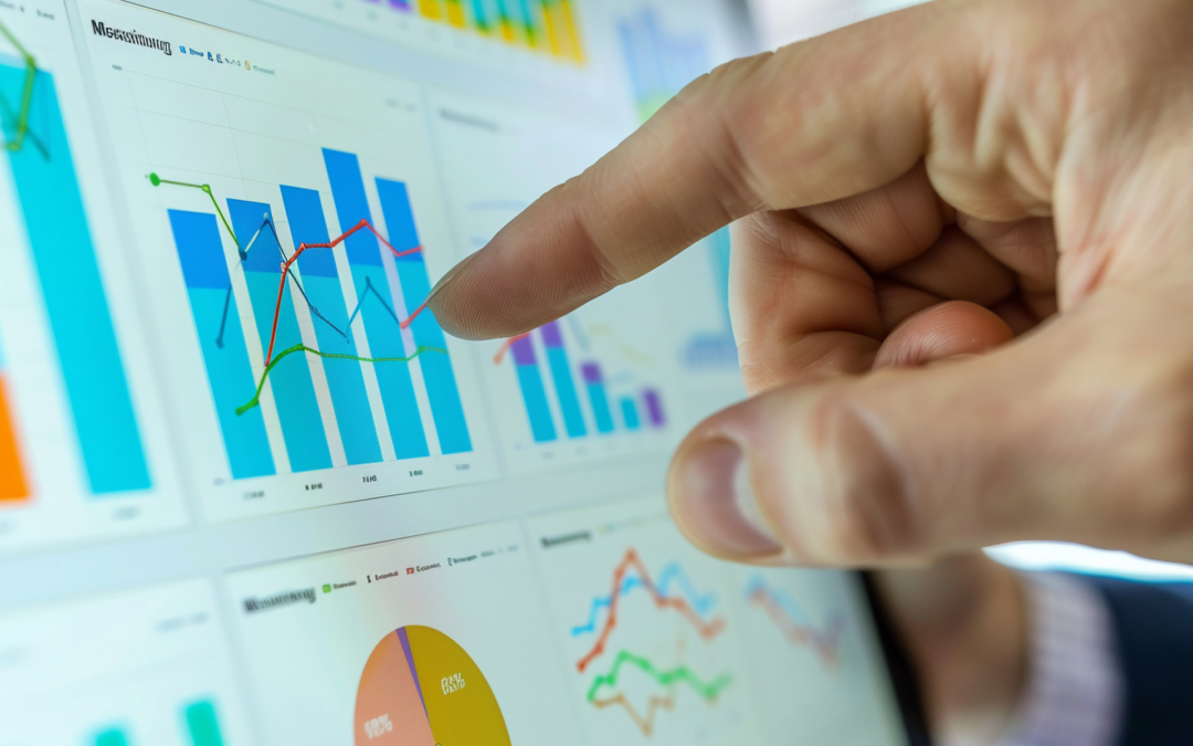
There’s a visual for almost every kind of question, and knowing which to use matters more than most realise. The right visual can simplify analysis, while the wrong one can confuse everyone in the room.
- Comparison Visuals: These are used to see differences between categories, regions, or time periods. Popular types include bar and column charts, which are a quick way to compare sales or revenue by team, region, or product and line graphs, which are perfect for spotting trends over time (such as monthly sales growth or website traffic).
- Composition Visuals: These show how parts make up a whole. They include pie charts for high-level overviews and stacked bar charts that reveal the contribution of each component (like marketing channels) to a total.
- Distribution Visuals: These help you understand how data is spread. Histograms show frequency of values and are ideal for analysing sales ranges or delivery times, while box plots identify outliers or performance variations across teams or branches.
- Relationship Visuals: These show how variables interact. Scatter plots reveal correlations between factors such as advertising spend and sales performance, while bubble charts add a third dimension, such as profit margin or region size, for richer insight.
What Makes Data Visualisation Effective?
A good data visualisation makes understanding effortless. It’s the point where data meets design and where clarity wins over complexity. Here’s what separates average visuals from great ones:
- Accuracy: The scale, proportions, and labels must reflect the truth, not exaggerate it.
- Context: Always include comparison points (previous months, targets, or benchmarks), so people can interpret results meaningfully.
- Simplicity: Every element must earn its place. Borders, backgrounds, and unnecessary gradients add distraction, not value.
- Narrative: A chart should tell a story. What happened, why it matters, and what should happen next.
- Consistency: Using the same colours and symbols across reports. If red means “risk” in one dashboard, it should mean the same everywhere else.
In a data-rich economy like ours, information is abundant, but attention is scarce. Visualisation is what makes data understandable, actionable, and memorable.
What Tools Are Commonly Used for Data Visualisation?
There’s no shortage of data visualisation tools, but some stand out for being both powerful and user-friendly.
Power BI: Power BI is one of the most popular choices for New Zealand businesses. It connects directly to your existing systems (Excel, CRMs, accounting tools) and creates dynamic dashboards that update automatically. This is ideal for teams that want interactive reports without needing a data science degree.
Tableau: For organisations needing customisation and high-impact design, Tableau remains popular. They allow deep interaction, tailored layouts, and complex visual storytelling for enterprise analytics.
Snowflake: Snowflake isn’t a visualisation tool itself, but it’s the powerhouse behind many modern analytics setups. It handles secure, scalable data storage in the cloud, ensuring your visuals are fed with accurate, real-time information. Combine Snowflake’s data infrastructure with tools like Power BI or Tableau, and you get both performance and reliability.
Choosing the right tool depends on your scale, technical comfort, and goals. As one of New Zealand’s leading data consultancies, we guide clients through setup, integration, and training, so the technology works for your business as seamlessly as possible.
What benefits could data visualisation bring to your organisation?
Data visualisation isn’t about making reports prettier; it’s about making them more profitable. When insights are clear and accessible, decision-making accelerates. Leaders spend less time interpreting data and more time acting on it. Over time, this transforms how teams collaborate, plan, and measure success.
Better visualisation means:
- Faster recognition of market shifts and performance gaps.
- Greater trust in business data and analytics.
- More productive meetings
- Stronger communication of results to investors and stakeholders.

Why Partner with FIRN Firn for your Data Visualisation
Local Expertise
New Zealand businesses work within specific market dynamics, and we understand the landscape. FIRN has supported organisations across sectors to turn raw data into visual tools that drive results. With proven experience and a commercial-first mindset, we design data visualisation solutions that align with both business objectives and compliance requirements.
Custom Solutions
No business sees data the same way, so we don’t build generic dashboards. Whether you need a lean operational view or a multi-layered reporting environment, FIRN tailors every dashboard to your structure, KPIs, and users. Our focus is on delivering performance, flexibility, and clarity that fits your exact requirements.
Cutting-Edge Technology
Behind every powerful visual is a solid engine. FIRN works with industry-leading tools and top-tier cloud infrastructure to build fast, scalable, and secure visualisation environments. Whether you’re cloud-first or managing hybrid systems, we ensure your dashboards keep pace with your growth and complexity.
Seamless Integration
A strong data visualisation solution fits into your ecosystem without disruption. FIRN dashboards connect smoothly with your CRM, ERP, finance, and operational platforms, eliminating silos and ensuring accuracy across every touchpoint. It’s all about creating a connected, intelligent workflow that turns data into decisions with minimal friction.
Ready to invest in your business growth?
At FIRN, we help clients design visuals that communicate insights instantly. The goal isn’t to impress; it’s to inform clearly and quickly, helping every stakeholder see the same story at once. If you’re interested in how you can start or improve your data visualisation process, reach out to our friendly experts.
Data Visualisation FAQs
Do I need a dedicated data team to use data visualisation tools like Power BI?
Not necessarily, tools such as Power BI are designed so non-technical users can build simple dashboards, as long as someone (like the FIRN team) sets up clean, reliable data models in the background.
Is data visualisation only useful for large enterprises?
No, data visualisation for business is just as valuable for small NZ companies, helping owners see cashflow, sales, and pipeline clearly without hiring a full analytics team.
Can data visualisation work with the spreadsheets we already use?
Yes, most modern data visualisation tools connect directly to Excel or CSV files, then grow with you as you move to platforms such as Snowflake.
How do we choose KPIs to show in data visualisation for business?
Start with the decisions you need to make, then pick a small set of measures that genuinely influence those choices, rather than tracking everything.